Give your stakeholders the big picture view of content strengths and weaknesses
A content scorecard is a review that evaluates your content against a set of criteria, by walking through specific scenarios. It shows how well your current content stands up to industry standards and best practices, and presents the results in an easy to understand format.
Benefits of a content scorecard
Content scorecards are great for demonstrating content strengths and weaknesses to busy stakeholders. When user testing isn’t an option, scorecarding is a fast and effective way to assess content. It can also be scaled to meet business and project needs.
Used alone, they are an efficient and effective way to evaluate important content and processes on your website. When used alongside a content audit, they help you understand the scope of a site redesign or rewrite.
Finally, scorecards also are valuable in helping establish project focus and priorities. It’s hard to ignore poor or failing grades in any area.
Download our free Content Scorecard template to get started
If you just want to see what it looks like, you can view the content scorecard template (PDF) in your browser.
Understanding a few guidelines
Before we start, remember that a content scorecard is subjective. The quality of the findings is dependent on your expertise as a content reviewer. You need a deep knowledge of writing mechanics and technique, usability and interaction design, information design, content marketing, and branding if you intend to provide a comprehensive assessment. Don’t evaluate any criteria you don’t understand. You’ll get better results if you limit the review to areas within your expertise.
Next, to eliminate the potential bias of a single reviewer, use three independent reviewers, if possible. Together, they can analyze discrepancies between opinions and provide focused, consolidated findings.
And last, remember that an expert review and content scorecard are diagnostic tools. Content validation should always include testing with real customers.
Creating your content scorecards
Select scenarios to evaluate
First, you must determine what scenarios you want to evaluate. A scenario is a user-framed question or problem, such as: “My subscription to the service is up for renewal. How do I renew it and purchase an upgrade?”. The scenario approach helps you stay focused on priority areas and a cross-section of page types.
To keep a user-centered perspective, you should conduct your scorecard review around user scenarios. During your review, you’ll be going through each scenario as a user would, and evaluate how the content you see and interact with meets the criteria you’ve identified in your scorecards.
Choose two or three key scenarios to evaluate.
Determine the criteria and categories
Next, you need to identify the right set of criteria to include in your evaluation. Choose detailed criteria across 5 to 8 core categories. When selecting criteria to assess, focus on the areas that are most important to your organization or relevant to your project. Don’t try to evaluate every content point possible.
Usability.gov has some great usability and design guidelines, many of which focus on content. You’ll also find tons of different usability and user-centred design guidelines adapted from Jakob Nielsen’s classic set of ten usability heuristics. The trick is to think about how these heuristics relate to the content and to make sure they are represented in your criteria.
When you’re finalizing your criteria, make sure they are specific, easily demonstrated, and organized into relevant categories.
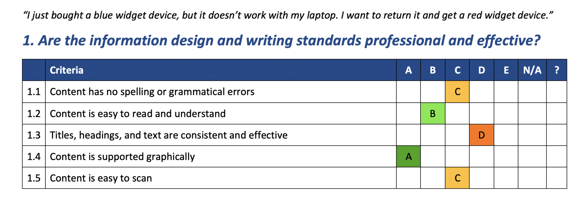
In the template: Your report should include one scorecard for each category, and each scorecard should list the specific criteria being assessed. In the template, the scenario being examined is “I just bought a blue widget device, but it doesn’t work with my laptop. I want to return it and get a red widget device.” The first category, 1. Are the information design and writing standards professional and effective?, is made up of five different and specific criteria (1.1 – 1.5).
In your own assessment, you will assess multiple scenarios, but they should all be assessed using the same categories and criteria.
Example criteria and categories
Feel free to use these categories and criteria in your scorecards, or modify them to suit your needs:
Content is on brand
- Content aligns with company voice
- Content uses the appropriate tone for the audience and purpose
Information design and writing standards are professional and effective
- Content has no spelling or grammatical errors
- Content is easy to read and understand
- Titles, headings, and text are consistent and effective
- Content is supported graphically
There is an appropriate level of substance and context
- Content is useful and substantial
- Content clearly indicates actions and next steps
- Content provides enough background info
Content is effectively focused on the audience
- Content speaks directly to the audience
- Content is focused on user needs
- Content meets the needs or answers the question posed by the scenario
Content is well organized
- Navigation path to scenario content is easy to find and follow
- Pages are organized logically and reflect user task flow
- Page content, paragraph, and sentence hierarchy is apparent
Content is current and relevant
- Content is up to date
- Content is relevant to the audience
- There are no gaps in the content
Conducting the review
Walk through each of the scenarios you chose one at a time, as if you are a user trying to complete each task. Keep track of the pages you visit and your assessment results in a spreadsheet that includes all of your criteria and plenty of space for notes.
There are two ways to capture findings, depending on the scope of your review:
- If you want a detailed analysis of each page, you can individually critique each page. In other words, you will evaluate each page independently, using the criteria in your scorecards.
- If you only want to capture the overall findings from each scenario, evaluate the walk-through as a whole. In this case, be sure to capture the path that you followed through the scenario.
The best part of using a scorecard approach is that you can apply a grading system that’s familiar to your audience. Like in school report cards, provide clear descriptions of what your grades mean.
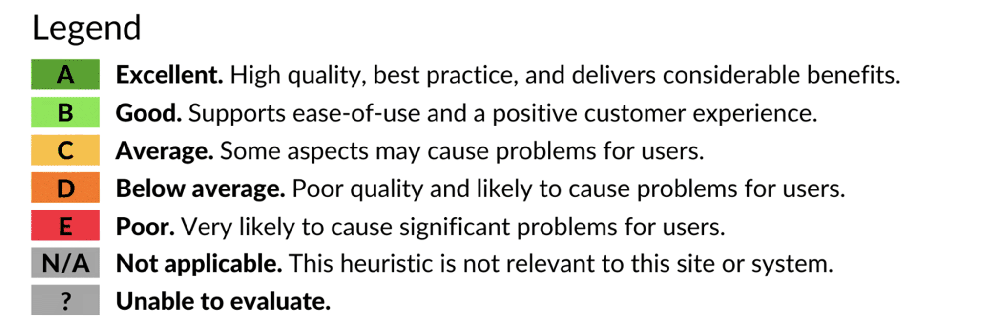
For example, use grades A to E to represent grades for excellent, good, average, below average, and poor. You can also include an N/A rating if the heuristic isn’t applicable to the content, and a blank category if the content could not be evaluated. By assigning a grade of A, B, C, D, or E, you get a snapshot of your content wins and failures.
Tip: Don’t try to evaluate all the criteria in one pass. Do multiple sweeps through the pages, focusing on different categories each time.
Documenting the findings
You’ll end up with loads of data from your review!
The challenge is to boil it down to key messages that are useful to you and your stakeholders.
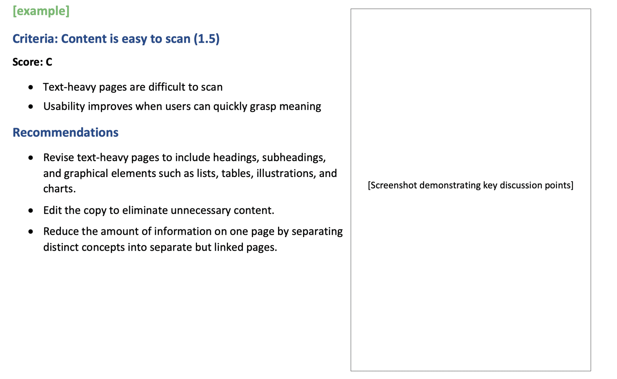
Usually, the focus of the report is on high-level findings and recommendations. Start by providing the big picture and then drill down into more detail. In each category, show examples of content for a few of the criteria with specific comments and recommendations. If a someone asks for more clarification about criteria that you didn’t mention, talk them through it or provide an example at their request.
Consider using the scorecard approach if you’re looking for an overall sense of quality related to user experience.


